TFO
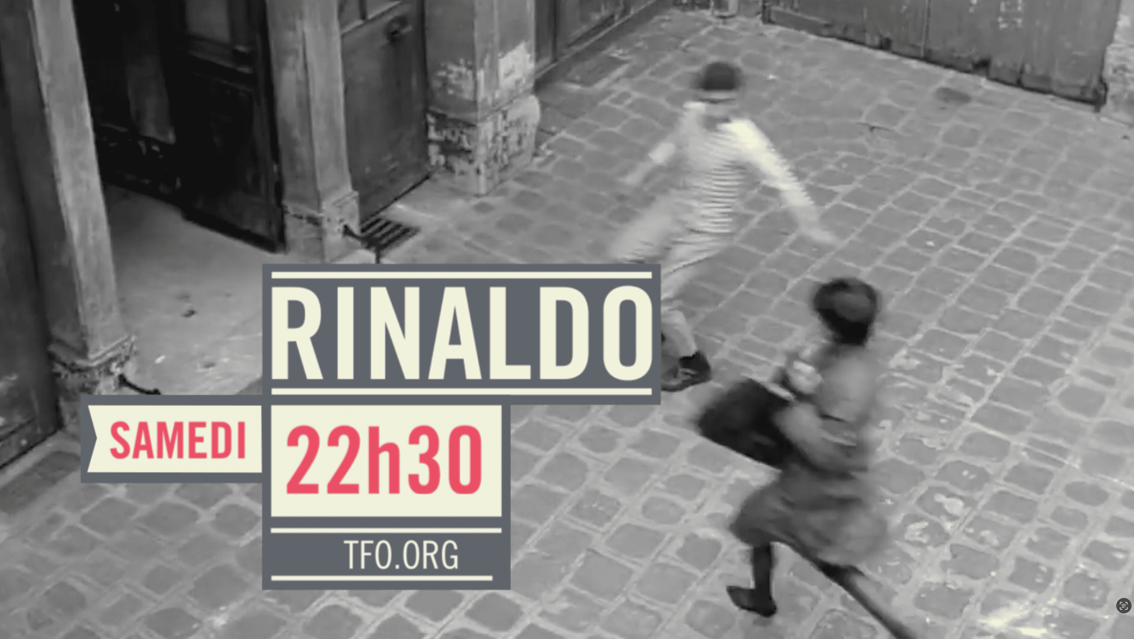
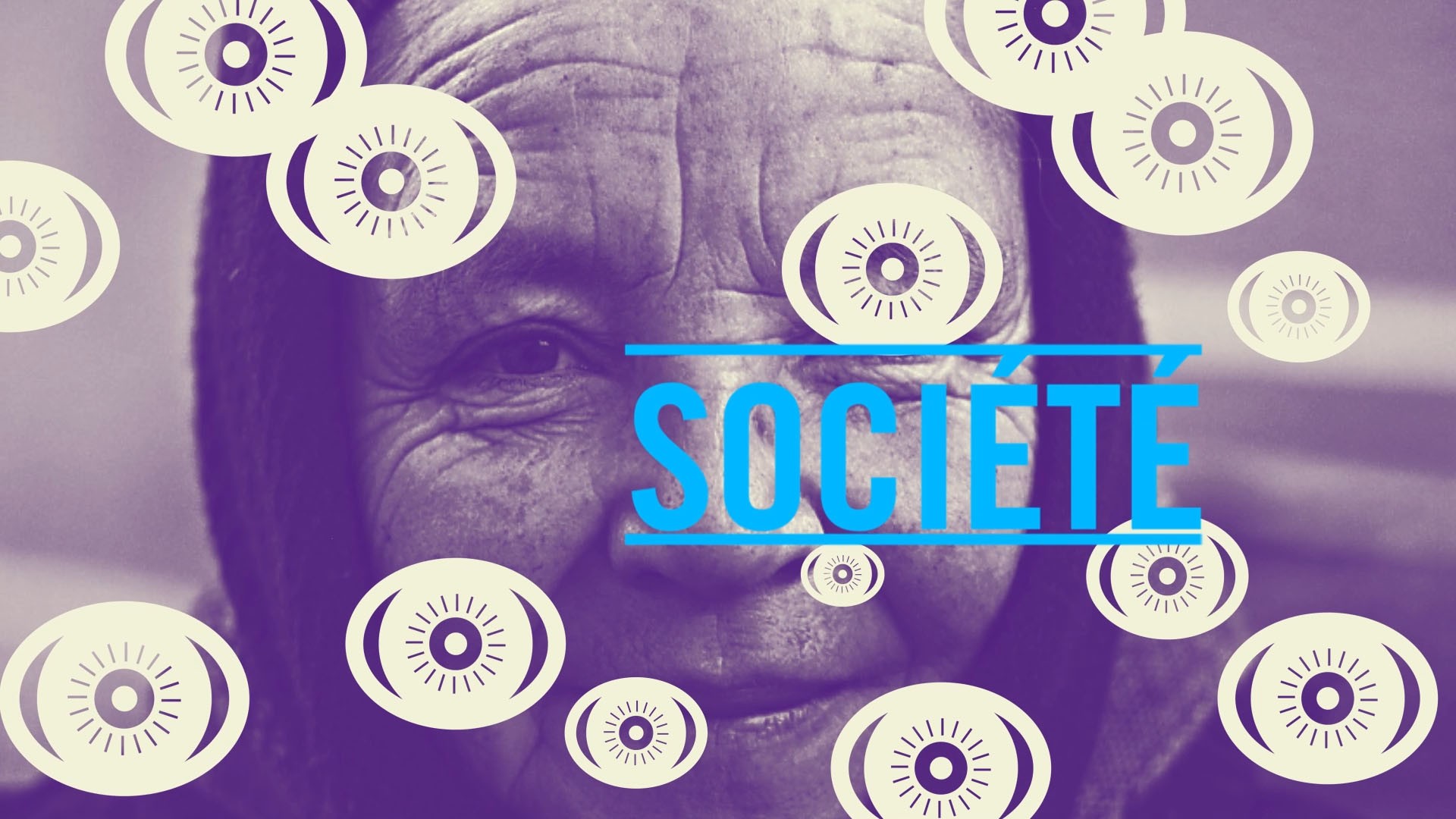
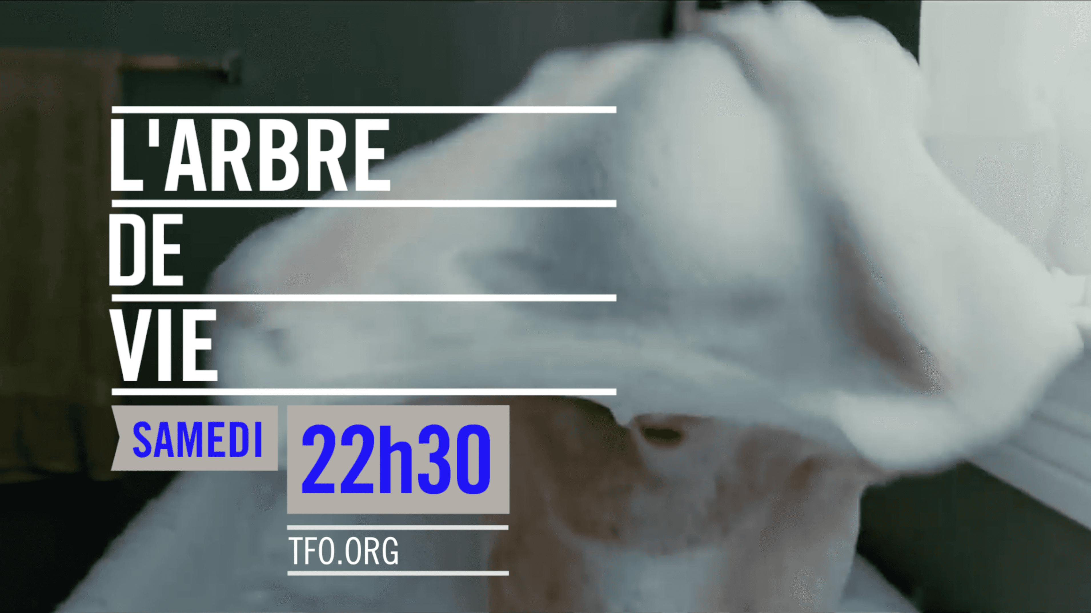
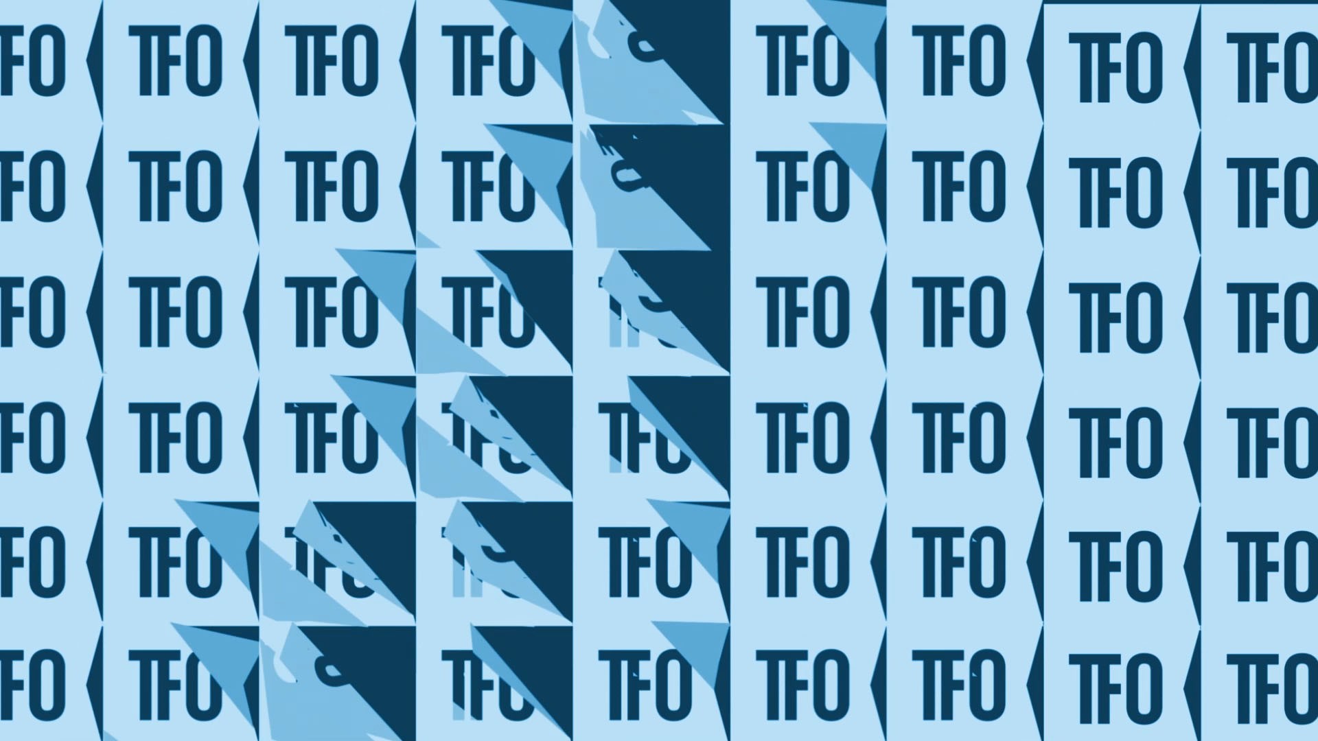
Rather than relying on the visual language traditionally associated with educational broadcasting, the rebrand for Télévision française de l’Ontario embraced a bold, contemporary graphic identity built around geometry, movement, and color. Clean shapes, vibrant palettes, and dynamic motion systems transformed the channel into something distinctly youthful and culturally current. Positioning TFO less as a conventional broadcaster and more as a modern creative platform for Francophone audiences outside Quebec. The design system balances playfulness with sophistication, using abstraction and rhythm to create a visual identity that feels optimistic, intelligent, and unmistakably modern. The result is a channel brand that feels energetic without becoming noisy. A confident reimagining of public broadcasting through a contemporary design lens.
Rather than relying on the visual language traditionally associated with educational broadcasting, the rebrand for Télévision française de l’Ontario embraced a bold, contemporary graphic identity built around geometry, movement, and color. Clean shapes, vibrant palettes, and dynamic motion systems transformed the channel into something distinctly youthful and culturally current. Positioning TFO less as a conventional broadcaster and more as a modern creative platform for Francophone audiences outside Quebec. The design system balances playfulness with sophistication, using abstraction and rhythm to create a visual identity that feels optimistic, intelligent, and unmistakably modern. The result is a channel brand that feels energetic without becoming noisy. A confident reimagining of public broadcasting through a contemporary design lens.